Receiver Operating Characteristic (ROC) Curve
Learn how to use the Receiver Operating Characteristic (ROC) curve to evaluate binary classifiers. Explore TPR vs. FPR trade-offs with Ultralytics YOLO26.
The Receiver Operating Characteristic (ROC) curve is a fundamental graphical tool used to evaluate the performance of
binary classification models. In the realm of
machine learning (ML), it visualizes the
trade-off between a model's sensitivity and its specificty across all possible decision thresholds. Unlike
single-value metrics like accuracy, which can be
misleading if a dataset is imbalanced, the ROC curve provides a comprehensive view of how a classifier behaves as the
criteria for identifying positive instances becomes more or less strict. This visualization is essential for engineers
utilizing supervised learning techniques to
determine the optimal operating point for their specific use case.
Interpreting the Axes and Trade-offs
To understand an ROC curve, it is necessary to look at the two parameters plotted against each other: the True
Positive Rate (TPR) and the False Positive Rate (FPR).
-
True Positive Rate (TPR): Often referred to as
Recall or sensitivity, this metric on the y-axis measures
the proportion of actual positive observations that the model correctly identified. High TPR means the system rarely
misses a target.
-
False Positive Rate (FPR): Plotted on the x-axis, this represents the ratio of negative instances
that are incorrectly categorized as positive, also known as a "false alarm."
The curve illustrates a dynamic relationship: as you lower the
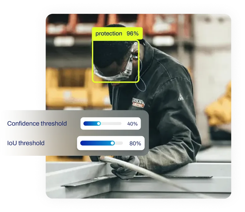
confidence threshold to capture more positive cases
(increasing TPR), you invariably increase the risk of flagging negative cases incorrectly (increasing FPR). A perfect
classifier would reach the top-left corner of the graph, indicating 100% sensitivity and 0% false alarms. A model that
makes random guesses would appear as a diagonal line from bottom-left to top-right. The overall performance is often
summarized by the
Area Under the Curve (AUC), where a value
of 1.0 represents perfection.
Real-World Applications
The decision of where to set the threshold on an ROC curve depends entirely on the cost of errors in a specific
industry application.
-
Medical Diagnostics: In
AI in healthcare, specifically for tasks like
tumor detection in medical image analysis,
the cost of missing a positive case (a false negative) is potentially life-threatening. Therefore, practitioners
often choose a threshold that maximizes TPR, even if it results in a higher FPR, meaning more healthy patients might
initially be flagged for further testing.
-
Financial Fraud Detection: When
AI in finance is used to monitor
credit card transactions, banks must balance security with customer experience. If the system is too sensitive (high
TPR), it might block legitimate cards (high FPR), frustrating users. Analysts use the ROC curve to find a balanced
threshold that catches most fraud while keeping
false positives
to an acceptable minimum.
Generating Probabilities for ROC Analysis
To plot an ROC curve, you need the raw prediction probabilities rather than just the final class labels. The following
example uses the state-of-the-art YOLO26 model to generate
classification scores.
from ultralytics import YOLO

# Load a pretrained YOLO26 classification model
model = YOLO("yolo26n-cls.pt")

# Run inference to get probability distribution
results = model("bus.jpg")

# Access the probability score for the predicted class
# These continuous scores are required to calculate TPR/FPR at different thresholds
print(f"Top Class Index: {results[0].probs.top1}")
print(f"Confidence Score: {results[0].probs.top1conf:.4f}")
Once these probabilities are collected for a validation set, developers can use libraries like
Scikit-learn to compute
the curve points. For managing datasets and tracking these metrics over time, the
Ultralytics Platform offers integrated tools for model evaluation
and deployment.
ROC vs. Related Concepts
It is important to distinguish the ROC curve from other evaluation tools:
-
vs. Precision-Recall (PR) Curve: While ROC plots TPR against FPR, the
Precision-Recall curve
plots Precision against Recall. The PR curve is generally preferred when the dataset is heavily imbalanced (e.g.,
detecting rare anomalies), as the ROC curve can sometimes present an overly optimistic view in such scenarios.
-
vs. Confusion Matrix: A
confusion matrix provides a snapshot of
performance at a single specific threshold. In contrast, the ROC curve visualizes performance across
all possible thresholds, making it a broader tool for
predictive modeling analysis before a final
decision rule is established.


.webp)